How to plot 3D data…
One of the greatests improvements of ctioga2 over ctioga is the
possibility now to handle gracefully 3D data, in the form of XY color
maps. As an example, we’ll use the following
data file
containing r and its sinus cardinal as a function of x and y,
together with x^2 - y^2 generated using the following Ruby code:
-60.upto(60) do |i|
  -60.upto(60) do |j|
    x = 0.25 * i
    y = 0.25 * j
    r = (x**2 + y**2)**0.5
    x2_y2 = 0.0625 * (x**2 - y**2)
    puts "#{x}\t#{y}\t#{r}\t#{(r > 0 ? Math::sin(r)/r : 1)}\t#{x2_y2}"
  end
end
Heat map display
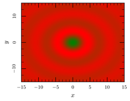
The most basic thing is to plot this data as a heat map. For
ctioga2 to understand you want a XY heat map, you need the
--xyz-map command:
ctioga2 -X --xyz-map 3D-data.dat@1:2:4
Note how the @1:2:4 is used to say that the X column is
the first, the Y the second and the Z the fourth (ie the sinus
cardinal).
To plot the last column x^2 - y^2, we may have used:
xyz-map
plot 3D-data.dat@1:2:5
xy-plot
math /xrange -15:15
plot '5*sin(x)' /color White /line-width 2
Here, we also show that it is possible to add normal XY plots after a
color map. Please be warned though that, for the moment, ctioga2
does not support transparency for color maps, so it is mostly useless
to try to display several color maps.
Adding a legend
That said, even if it is rather easy to recognise the cardinal sinus
in the plot above, getting precise values is yet another thing. To do
that, you need to setup a so-called Z axis using --new-zaxis and
instruct ctioga2 to use that axis to display color map:
ctioga2 -X --xyz-map --margin 0.03 \
	--new-zaxis zvalues /location right \
    	3D-data.dat@1:2:4  /zaxis zvalues
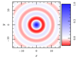
In addition, using the --color-map command or the corresponding
option, it is possible to be more precise about which colors to use:
ctioga2 -X --xyz-map --margin 0.03 \
	--new-zaxis zvalues /location right \
    	3D-data.dat@1:2:4  /zaxis zvalues \
	/color-map '#f22--#fff(0)--#22f'
The #f22--#fff(0)--#22f snippet is used to define precisely the
color gradients. It goes from red (#f22) to white (#fff) at @z = 0
to blue (#22f). Any number of points can be specified thus, allowing
for rather complex effects.
More about colors
The color of the heat maps is governed by something called a
color-map, that defines a mapping between Z values and
colors. It is a list of color names separated by --, optionally
followed by a Z value at which the given color should be
applied exactly. If the latter is missing, colors are evenly spaced
inbetween colors of known Z values:
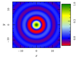
xyz-map
new-zaxis zvalues /location right
plot 3D-data.dat@1:2:4 /zaxis zvalues /color-map \
     "Red--Purple--Blue(0)--PowderBlue--Yellow--Green"
Alternatively, it is possible to use a color set
as colormap, which works exactly as if you had specified the whole
list of colors separated by --. It combines very neatly with the
color sets coming from colorbrewer:
xyz-map
new-zaxis zvalues /location right
plot 3D-data.dat@1:2:4 /zaxis zvalues \
     /color-map cb-prgn-11
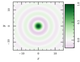
In that case, however, the results are somewhat not satisfying, since
the very strong purple color for the first minimum of the function may
seem to imply that the minimum is as pronounced as the maximum at
0,0, which is not the case. To avoid that, it may be better to make
the color map symmetric around a certain Z value, here 0 would be
the best:
xyz-map
new-zaxis zvalues /location right
plot 3D-data.dat@1:2:4 /zaxis zvalues \
     /color-map cb-prgn-11:around:0
See how now the minimum seems much less marked, and how the intensity of the color is more representative of the amplitude of the function ?
By default, the colors for the Z values inbetween the specified colors
are interpolated linearly in the RGB color space. You can also choose
to interpolate on the color wheel, by prefixing with hls: (hue light
saturation). See how that changes the look of the above red white blue
wheel:
xyz-map
new-zaxis zvalues /location right
plot 3D-data.dat@1:2:4 /zaxis zvalues \
     /color-map "hls:#f22--#fff(0)--#22f"
This works also when using color sets.
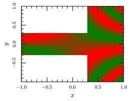
Heterogeneous maps
Most heatmap drawing software only work properly when all the points
are aligned on a complete homogeneous grid. From version 0.12,
handles more gracefully the case when the grid is heterogeneous and/or
not complete. However, as it still works in terms of homogeneous
grids, it will not work properly with scattered data. Here is an
example using the smath backend:
xyz-map
smath /samples=101 /urange=-1:1 /vrange=-1:1
plot sin(12*u*v) /where 'x > 0.3 || y.abs < 0.3'
Mind that the /where clause thinks in terms of x and y
coordinates, but the smath backend uses u and v as
parameters.
Contour plots
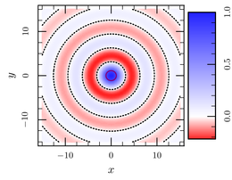
Finally, it is possible to draw contour plots using the
--draw-contour command, that takes as argument the desired Z level:
ctioga2 -X --xyz-map --margin 0.03 \
	--new-zaxis zvalues /location right \
    	3D-data.dat@1:2:4  /zaxis zvalues \
	/color-map '#f22--#fff(0)--#22f' \
	--draw-contour 0.8 /color Purple \
	--draw-contour 0 /color Black /style Dots \
Only contours
By setting --fill-transparency to 1, it is possible to fully
disable the display of the maps, which can be useful if you’re only
interested in the countour plots, see:
ctioga2 -X --xyz-map --margin 0.03 \
    	3D-data.dat@1:2:4 /fill-transparency 1 \
	--draw-contour 0.8 /color Blue \
	--draw-contour 0.4 /color Red /style Dashes \
	--draw-contour 0 /color Green /style Dots
However, as of version 0.1, a lower value for --fill-transparency
will have no effect, ie partial transparency is not supported yet.
Starting from ctioga2 version 0.5, there is a much better way to
display contour plots, which we present below.
Important note: the plots based on --xyz-map work only on
uniform XY grids (at least as far as version 0.1 is
concerned). However, the next bits will present other ways to display
non-uniform data.
XY Parametric plots
What I call parametric XY plots are plain XY plots where some details of the presentation (for now, only colors) depend on Z values.
Warning: XY parametric plots are still experimental, and their syntax is still not fully defined. Things presented here will probably not change much, but they may…
For the sake of the example, we will use the following data file generated using:
0.upto(40) do |i| # X values
  1.upto(4) do |j| # Z values
    x = i * 0.2
    y = 1/(1 + j/x)
    puts "#{i}\t#{y}\t#{j}"
  end
end
They represent various saturation curves with different saturation parameters. Its easy to display all the curves in one go:
ctioga2 -X --xy-parametric --margin 0.03 \
	--marker auto parametric-data.dat@1:2:3
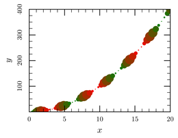
Control more aspects of the plots with parametric data
Starting from ctioga2 version 0.7, it is possible to use more than
one Z value and to select which aspect of the graphs they control (for
now, symbol color and size), using the /z1 and /z2 options to
xy-parametric:
xy-parametric /z1=marker_scale /z2=marker_color
math /trange 0:20 /samples=50
line-style no
marker auto
plot t:t**2:0.1+sin(t)**2:cos(t) /marker-scale 1.3
Here, we take advantage of the parametric plots using the
math backend. We use two different Z values to control both
the size of the symbols and their color: we plot a parabola t:t**2
whose symbol size /z1 is dictated by a sine function 0.1+sin(t)**2
and its color a cosine function cos(t).
See how the math backend switches to parametric plots as
soon as you have more than one :-separated column.
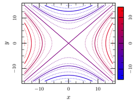
Only contours, second take
Starting from ctioga2 version 0.5, it is possible to plot automatic
contour plots using the --contour plot style:
contour
margin 0.03
new-zaxis zvalues /location right /bar_size=4mm
plot 3D-data.dat@1:2:5  /zaxis zvalues \
	/color-map 'Blue--Red' /contour-minor-style Dots
In this mode, ctioga2 computes automatically the level lines and
draw them using the given color map and line style. By default,
ctioga2 draw major and minor level lines (similar to minor and major
ticks on axes). The /contour-minor-style option controls the line
style of the minor ticks (while that of the major ticks is controlled
by the usual /line-style option). The /bar_size controls the width
of the Z axis bar (see that the bar is smaller than in the previous
examples).
